Friday, November 28, 2008

Anselm Kiefer (Kate's Pick)


I have been looking at Anselm Kiefer's work lately specifically as it relates to book arts and sculpture, though his career involves a variety of themes and media.  A German artist who studied under Beuys, Kiefer is well known for his paintings and themes regarding German culture after the Holocaust. 

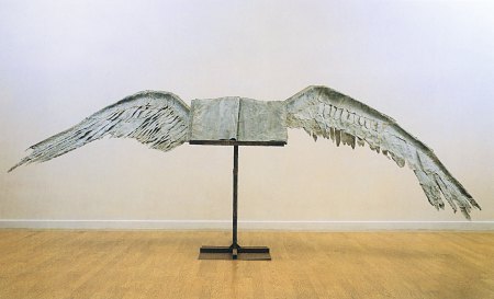
As Kiefer moved into the domain of sculpture, he began to incorporate the ideaof the book.  In his own words: “The book—the idea of a book or the image of a book—is a symbol of learning, of transmitting knowledge. I make my own books to find my own way through the old stories.”  I am particularly interested in his meditation on the book as a symbol and its vast cultural significance. Many of his book sculptures communicate that they have history and "weight" - both literally and figuratively, as the sculptures are made of lead.  Book with Wings is an example of one of these works, and shows that Kiefer imbues these sculptures with spiritual qualities as well.  Where Rachel Whiteread's plaster casts asserted the absence and namelessness of books, Kiefer strongly asserts their presence and physicality.  The two artists show very different ways of approaching the same thematic object.

Though somewhat unrelated, in my searches for Kiefer images I came across a site referencing an Italian exhibit of book arts that made some interesting statements: “What happens when the book object, the book idea, the book 
thought is transformed by the artist and exhibited in an art gallery (where the book as such is not the object to be shown)?
The book changes its nature:
from a subject to be consulted to an object to be contemplated.”

For other images and information on Kiefer, see his section of the Gagosian Gallery site here.  There is also an extensive review (plus images) of some of his more recent paintings and sculptures here, outside the realm of book arts.

Monday, November 24, 2008

Tierney Gearon (Nicole's Pick)


Tierney Gearon is a unintentionally controversial photographer. Much like Sally Mann (http://en.wikipedia.org/wiki/Sally_Mann) , she has been accused of child pornography and exploitation of her kids. Tierney is a true artist in every sense of the word. This is a woman who regardless of recognition she would be making pictures of her family. Photography is her way to understand things in order to process them. Tierney's website it currently under construction but if you go to this link (http://en.wikipedia.org/wiki/Tierney_Gearon) you can see more of her pictures and read articles of people who feel offended by her work.

The below works are photographs of Sally Mann.


Friday, November 21, 2008

Adam Phillips and Michael Swain (Scott's Pick)

For my last post, I've decided to use two different animators rather than just one. This is simple because I couldn't decide which one of them I wanted to post. They are not related and they are each awesome for their own reasons. The first animator I picked was Adam Phillips, who in my opinion may be the best internet animator alive. His work is simply amazing, fluid and colorful. He is an ex-Disney animator who left the corporate world and became an indie animator of nearly unmatched talent. His backgrounds are stunning. His characters are relatively simple, yet they have a whole lot of personality. His Brackenwood series (found here: http://www.newgrounds.com/collection/brackenwood.html) consists of the adventures of a single character in a beautifully developed world, which is particularly surprising given the series lack of dialogue. If you watch no other, than I suggest the YuYu (http://www.newgrounds.com/portal/view/310851) simply because it requires no knowledge of anything else in the series, isn't that long and is incredibly beautiful. If I had to relate his work to anything, it would be that Ornulf Opdahl for his ability to create an atmosphere and a full world without being too excessive about it. Here are some pictures of his:


But seriously, go watch his animations. They're amazing. Now, onto the next animator of the day: Michael Swain!


I picked Michael Swain, simply because he is awesome. He winds up putting a lot of detail into his backgrounds and characters, but doing very minimal movement with them. He still manages to create the illusion of life despite the little amout of movement that he uses. Check out his Mastermind series (all his animation can be found here: http://www.theswain.com/cartoons.htm). If I had to relate him to any of the other artists posted here, I'd have to say T.S.R., whose ability to create a strange atmosphere through their work is lauded by Emily. I don't know if I'd call his work grotesque, but twisted would certainly fit. His ability to create a strange mood is quite admirable. His other famous series would be the Blockhead series (found at the same link above), which is a far less obscene and even more quirky series. In this, the animation is even simpler, and the character design for much of it consists of a guy in a recliner (the conscience) and a smiley face with a body attached (the psychotic). These guys are some of the best animators on the web, and I seriously suggest giving them a look. Here are some pictures from Swain, but as I've written before, I highly suggest that you go and watch their animations, as these pictures really don't do their work justice.

Thursday, November 20, 2008

Alice Neel (Slater's Pick)


Alice Neel was born in Philidelphia in 1900 and lived until 1984.  She is often recognized as one of the great American painters.   While Neel painted landscapes and still lives, she is most known for her portraits.  Her paintings can be distinguished for their playful use of line and color creating expressions of emotional intensity.
Neel was received her degree in art at the Philadelphia School of Design.  Neel is described as a "painter with a strong social conscience and equally strong left-wing beliefs." In the 1930s Neel packed up her belongings and embraced the diversity of Greenwich Village, NY.  She became an activate participant for the Work Progress Administration by painting urban landscapes.  In 1938, Neel moved again, taking her career to Spanish Harlem, painting the Puerto Rican community as well as neighbors, acquaintances and people in passing.  In the 1960s, Neel continued to paint "political personalities, including black activists and supporters of the women's movement."  Neel became a role model for women for supporters of the feminist movement.
I am very moved by Neel's success and devotion to making artwork that is aesthetically pleasing while maintaining a balance of "social conscience " in conjunction with her liberal themes.  

go to:


Daniel Zeller (Jess' Pick)


Daniel was born in California in 1965. He then moved to the East cost to study at UMass Amherst and then

He Now exhibits all over the country, though the majority of his exhibitions are in NY.


Daniel Zeller creates incredibly intricate works of art on paper, that have often been said to look like something from a topographical map. He works in a very organic way, and never plans out his drawings. He starts with a general idea and then just goes to work and sees what he comes up with. Zeller always works in multiple drawings at a time, he keeps them all in a draw and works on whatever piece inspires him that day.

This is an awesome video of Zeller sitting in his studio drawing and talking about his process/medium/ EVERYTHING. It's pretty awesome and says way more about him that I ever could, so check it out!

Wednesday, November 19, 2008

Ornulf Opdahl (Audrey's Pick)


Ornulf Opdahl is most widely known for his landscape work of his home country Norway. The beauty and simplicity of his paintings remind me of Eliza's pick, David Armstrong. Like Armstrong, Opdahl takes simple forms (which aren't necessarily simple images) of the environment in which he grew up and creates beautiful depictions of Norway's coasts. His paintings are not realistic like Armstrong's, however. Their abstract quality evokes intense atmosphere of Norway's ominous nature.


While these landscapes depict existing areas of the islands and coastlines, it appears as though Opdahl is seeing things in shapes instead of as cliffs or valleys or oceans, which gives the paintings that abstract sensation. Something that always impresses me about an artist is the ability to generate such power with a subtle shape or form mixed with color and light. With these shapes and wintry tones, Opdahl creates such mysterious dreary qualities for the viewer. However, there is always a luminescence in the landscape, whether it's the sky or the reflection of light on the side of a mountain or in the snow, that warms these otherwise dark pictures.

Opdahl was born in 1944 and lives and works in western Norway, painting and drawing. He studied at the Norwegian Art Academy and began regularly exhibiting work soon after with figurative paintings which evolved into paintings of the natural world. A recent project he worked on consisted of sketching marine creatures while on board the RV G.O. Sars ship in 2004.

this foreign website offers a great selection of more brilliant images (but not textual information)

this is a really short neat clip of Opdahl at work and on the ship

Monday, November 17, 2008

The art pulse in NYC


Last Friday, the New York Times published a series of articles describing the current exhibitions in several neighborhoods in New York. The articles serve as efficient resources for the pulse of art/galleries in New York .

Saturday, November 15, 2008

Dale Chihuly (Greg's pick)


The newly reopened RISD museum, designed by José Rafael Moneo, features the work of renowned artist Dale Chihuly. His glass scluptures are what might be called contemporary baroque - with a profusion of color and form. He does free standing works as well as installations- and the RISD museum exhibtion showcases his work, past and present. From Clark its less than an hour away! Make the trip.

Friday, November 14, 2008

Flora Hanijito(Melissa's Pick)


Flora Hanijito is a photographer based out of New York, originally from Montreal. Her photos speak about isolation and depression. She captures those small moments when the subject is alone and really feels that way.

Her use of color is dark and helps feed the feel of heaviness to her photos. They are muddy and muted, not vibrant. I also really enjoy the lighting of her subjects. She has good control and use of the elements (color, lighting, exposure) of photography to create cohesive photographs.
Her use of diptychs and triptychs is also interesting and refreshing. Instead of being flooded with them, they exist occasionally as they are needed. In other words, she doesn't force a series of them, it seems as if the work choses to become a diptych or triptych itself.

I really recommend taking a few minutes and seeing her other photos. Her use of the figure is sometimes overdone, but her photos are worth it.


Website: FloraHanijito.com
Flora At Dossier Journal: DossierJournal.com

Tuesday, November 11, 2008

Davin Youngs (Sara's pick)


Davin Youngs is a photographer who lives and shoots in Chicago, Illinois. He graduated from Oberlin Conservatory of Music and is now pursuing photography as well as a musical career. Youngs shoots his surroundings, family and friends; he's
‘drawn to moments that are a bit awkward and quiet’. His images are normal scenes from his daily life which he captures with thoughtful tenderness to create quiet magical moments that seem almost surreal, like stills from a movie.

Youngs' work reminds me of Andrea Modica (Marissa's pick). Both artists stage portraits on occasion, but always with the intention of exploring what exists through photography, not creating something exclusively for the photograph. While Modica is following the story of a girl growing up in poverty, Youngs follows his own friends and family. But both photographers are interested in the personal lives of people. Youngs explores his relationship with his parents by photographing them; Modica builds a relationship with a family through photography.

I'm interested in Davin Youngs' work because I'm also drawn to awkward quiet moments. I want to capture the personalities of people through their environment as well as their likeness. Youngs shoots environmental still lifes as well as portraits but doesn't attmept to relate the two or create connections in that way. Like Modica and Youngs I'm not opposed to directing a poratrait or altering a space slightly to make the photo, but I don't want to stage a whole shoot. I'm not interested in creating a world, like these artists I'm intruiged by the one I see everyday.

Youngs made a very touching series called "A Project With My Father, 2007" exploring his relationship with his father which includes portraits and interview style dialogue between them. You can find it on his website under Pictures.

Website: http://www.thesearemypictures.com/index.html
Blog: http://www.flickr.com/photos/dyoungs/

Sunday, November 9, 2008

Frames


For some ideas on framing, I would suggest going to one of the Boston stores- Dick Blick in Boston, which is my current favorite, Pearl Paint, or Artist & Craftsman Supply in Cambridge. Their websites don't really match with what's in stock.

Another very good option is making the drive to Ikea (whose website comes the closest to what you can buy in-store). In all stores, look for black or white frames (very nice ones at Ikea), and think about sizing your image to fit the frame. Matting is not the standard route any longer, and many artists are going for draping the paper over solid mat or sizing the image just inside the edge of a the mat window.

See the websites for specific sizes... and ask if you are considering some options!

Saturday, November 8, 2008

Monochromatic Cathedral for Chris

Sant'Ivo alla Sapienza
Borromini
Roman Baroque style, built between 1642-1660
Created for a Roman University

Monochromatic is possibly something to consider? Probably one of the more powerful spaces I visited during my time in Italy.


Friday, November 7, 2008

Kelli Connell (Janna's Pick)


Kelli Connell is a photographer that Greg suggested I look at. She was born in Oklahoma City in 1974. She received a BFA in photography from University of North Texas (1997) and an MFA in photography from Texas Woman’s University (2003). Connell creates scenes using one model who plays two roles, often one feminine and one masculine. She scans two or more negatives and manipulates them together in Photoshop. The scenes she creates in her photos are about intimate moments in relationships and by having a woman play both the traditionally femine and masculine parts, she is questioning gender roles. She states, "Through these images the audience is presented with constructed realities. I am interested in not only what the subject matter says about myself, but also what the viewer's response to these images says about their own identities and constructs."

I found Connell's work very interesting because of the parallels to my work now, putting an image of myself into an old photo to create a sort of narrative. I have also experimented with taking double self-portraits and stitching them together in Photoshop like Connell does with her model/friend. I've a lot of people trying it online, but the doubles are usually like identical twins. I find Connell's more intesting because of the different roles played by the model, so that at first glance you don't realize it's the same person.


Kelli Connell's official site
MoCP's page about Connell
New York Times review

A photographer who often does self-portrait "clones"

Tuesday, November 4, 2008

Discussion Topic: Medium

November 5, 2008

On 'Medium'

For many artists, the choice of medium is as specific and personal as the choice of subject. The artist’s relationship to the medium shapes how the work is executed and understood. Reflecting on this process will give us greater insight on why we choose to work in the way we do.

1. Write a 250 word essay describing your relationship with your medium for our class. The essay can be humorous and anecdotal- you can even write it from the perspective of your medium or materials- and their commentary on you. Consider the following questions.
• Why do you choose to work in this medium/media?
• How long have you been using this medium/media?
• How would you describe your approach within the medium/media?
• What are the advantages?
• What are the limitations?
• How does this medium/media relate to your chosen theme for the semester?

2. Read the interviews with Chuck Close and Ryan McGinley be prepared to discuss.
Chuck Close (passed out during class)

Ryan McGinley - interview link here

Due November 12 or 14

Collaborative Showcase / Fashion Show Exhibition

The second exhibition held in Traina’s Schiltkamp Gallery will be a Studio Art Collaborative Showcase – featuring the work from a number of Clark art classes. The exhibition will also be coordinated with the Clark Fashion show- and both will share the same opening reception, on Friday, December 5, from 6 – 9 pm.

We will participate by exhibiting a selection of small works- one from each student. While this is not a major focus of this class, I am hoping it will give us a chance to think about presentation and small scale works. Each student’s piece should be ready to hang, and fit within the dimensions 12 x 12 x 12 inches. While 3d pieces are acceptable, please make arrangements with me ASAP if you intend to display your piece this way. You may create something new, or use a work that you have already finished.

These pieces are due at 4 pm on Wednesday, November 17th

Sunday, November 2, 2008

Calendar

Here is our calendar for the remaining weeks...

Week Ten
November 5 & 7 Discuss Method and 'Flow’
Consider William Kentridge
Partner Critique in Section, new works
Meet in Estabrook

Week Eleven
November 12 & 14 Discuss ‘Medium’
Consider Chuck Close & Ryan McGinley
Artist absent critique
Meet in Estabrook

Week Twelve
November 19 Guest Critic Susan Stoops, curator of contemporary art at the Worcester Art Museum
Group Meeting in Traina and the Estabrook
Everyone gets a crit!

Week Thirteen
November 25 Thanksgiving- no class.

Week Fourteen
December 3 & 5 Discuss ‘Practice’ / Artist Studio Visit
Studio Visit Write-up Due
Critique in Sections, new works
Meet in Estabrook

Week Fifteen
December 10 Final Group Critique. Meet at 1 pm
Meet in Traina and then Estabrook
3rd and Final Blog entry due by December 8, 5 pm

Week Sixteen
December 15 Studio Topics Individual Review for Entry to Thesis
Set-up beforehand in Traina/Estabrook