October 31, 2008
On Artistic Production and ‘Flow’
1. Reading (from Handout)
“Chapter 5: The Flow of Creativity” from Mihaly Csikszentmihalyi (pronounced "chick-sent-me-high-ee") Creativity: Flow and the psychology of discovery and invention, Harper Collins 1996.
2. William Kentridge
Read the article/interview and watch the following youtube videos on William Kentridge. Be prepared to discuss. Consider how his work follows the concepts described in the reading.
Article/interview
Automatic Writing
Venice Biennale
3. Activity and Response
a) Write up a plan for your artwork production for the week that will simulate the process of ‘flow’ described in the reading. This should be in a written (with optional graphics/drawings). (100-200 words)
b) Work for 7 hours straight without interruption. Normal needs like bathroom breaks, meals, etc are fine, but you should not be receiving or sending phone calls/messages, checking email, or doing anything that will break your concentration on making work.
c) Write up a reflection on this process- specifically describing how your experience relates to the 9 elements from pp. 111-113. (400 words)
Meet in Estabrook to discuss and share new works from 7 hour production time.
******
See Mihaly Czikszentmihalyi
See this video of Mihaly Czikszentmihalyi, where he asks, "What makes a life worth living?" Noting that money cannot make us happy, he looks to those who find pleasure and lasting satisfaction in activities that bring about a state of "flow."
Thursday, October 30, 2008
T. S. R. (Emily's Pick) - Happy Halloween


I stumbled upon a page called "A Case of Curiosities" while looking up some taxidermy-inspired inspiration. "A Case of Curiosities" seems to belong to an individual known as T. S. R., a San Francisco native who is infatuated with "18th and 19th century French, German and Russian fairy tales, the curiosity cabinets of the 16th-19th centuries, Victorian grotesque and anthropomorphic taxidermy, reliquaries, surrealism and a touch of the circus sideshow." Sounded like it was right up my alley.
What makes T. S. R.'s work special is not necessarily his taxidermy skill, but rather the mood elicited through his pieces. They make me feel, personally and honestly, weird. What on earth is happening in this "Birmingham Diva" pigeon assemblage (with the red background)? I think what really changes these pieces and drags them from typical "cutesy" anthropomorphized taxidermy are details like the tiny rodent skeleton clutched in her hands. T. S. R. excels in Alice in Wonderland, surreal-style horror show stuff that is delightfully grotesque. It doesn't make you want to be sick, but it is distinctly off-putting.
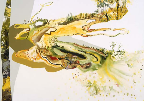
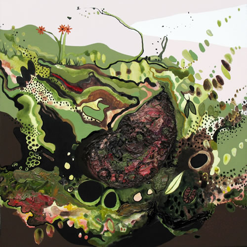
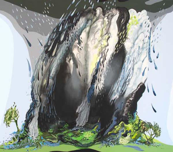
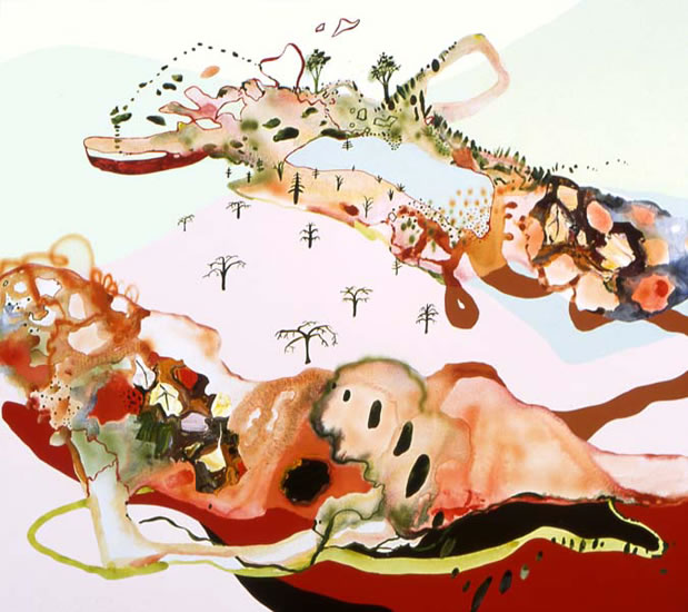
Though they seem to live in entirely different worlds, I would compare T. S. R. to Casey's pick, Sandy Litchfield. Her paintings allow the viewer a new view of the world around them, giving life and movement to typically stoic and unfeeling topographical maps. T. S. R. also gives life and movement to the stoic and unfeeling, only creepier.
If you're feeling brave, see more of T. S. R.'s work here: A Case of Curiosities.
Marlene Dumas (Akio's Pick)


Marlene Dumas is a South African-born painter. Her works have been shown in major exhibitions around the world. I have seen her artwork a couple years ago in the Museum of Contemporary Art Tokyo. There I saw many of her impressive works in ink and mixed media.
The works of Dumas could be related to that of some of the previous artists like Tracy Emin (one of the discussion artists) in a sense that they both seem to be attempting to get their essential messages across by represent their works rather explicitly and violently. The artist's themes include racism, religion, and sexuality.
I especially like Dumas' use of media, the way she let the ink or color bleed and flow. The touches of the brush are rather soft and delicate, and yet the painter manages to make the works so intense and expressive. Also, a critic says Dumas "blurs the boundaries between painting and drawing." Similarly, what is known as the East Asian 'ink painting' should be categorized as a painting or drawing is debatable, since the ink painting is about depicting the essence with the minimum amount of lines and details. Painting, on the other hand, often refers to a type of work made by layering one color on another, like how it is done in oil paintings.
Wednesday, October 29, 2008
Andrea Modica (Marissa's Pick)

Andrea Modica became most well known for her book "Treadwell". She was a young artist from Brooklyn when she decided to follow the life of a little girl, Barbara, and her family in Treadwell, NY (population 200) in 1986. She photographed them for nearly a decade and in turn became a facet in their world. Many of her images are beautiful as well as uncomfortably real. She creates (and documents) this little girl's unique and dark adolescent experience. Though many of the images in this series are composed, she reveals a very real and psychologically poignant portraits. The fact that Barbara is growing up in poverty and battling diabetes is the only really clear narrative within the series; she leaves a great deal of interpretation to the viewer. They all seem to be these dramatic fleeting moments but don't depict any particular happening.
I am always really amazed at how involved an artist can become to their subjects. Although her presence with a camera had to have had an impact (as I really feel it always does, unless the subject is unaware), she is still documenting their lives in a personal way. I can see how this work relates to Sarah's pick last week of David Hilliard. Though his presences is obvious, even in his technique, he evokes a feeling of a personal moment.


David Armstrong (Eliza's Pick)


The late David Armstrong is a watercolor artist who creates realist paintings of his surroundings.
David Armstrong's work attempts to portray beauty through commonplace subjects. He believes the best statements of beauty are simple ones and thus he painted the things he saw on a day to day basis which were most often landscapes.
"My work attempts to present my vision of beauty through ordinary elements of the commonplace. I believe great works of art are not achieved through complicated statements, but rather simple ones, which allow painter and viewer alike to see beneath the surface, to question, and in our individual ways, to attempt an answer to the question of how we integrate our human needs with the natural world. In my pictures I attempt to feel -- a sense of time and place -- a moment of light, movement, and mood reflective of the world around me. In essence, my paintings reflect specific times and emotions of my life."
I enjoy his work because of his use of color and his ability to take something very simple and make it beautiful. His brushwork is meticulous in creating a seamless image which viewers can easily believe in.
I believe David Armstrong's work most closely relates to Audrey's pick for this week, George Shaw, as both artists paint the things they have seen day to day in their life. While Shaw focuses on memories of childhood, David Armstrong's work focused on different moments, times, and feelings throughout his life.
Jeff Bandelin (Scott's Pick)


My pick for this post is Jeff Bandelin, creator of the (in)famous Tankmen series among other animations. The reason I chose Bandelin as my artist is his ability to create a convincing animation using very little hand drawn animation. He excels at creating an animated world complete with (relatively) lively characters despite the fact that very little of their movements are actually animated. Take for example the hand movements in his Tankmen cartoons. They tend to consist of one or two frames, but he is quite adept at hiding this by having enough tweening (movement done by a computer) going on that one does not notice how little movement the characters are actually doing.
Bandelin's animations are excellent not only for his ability to animate, but for his abilities in writing clever and humorous dialogue, dead on voice acting and overall tone of his shorts. He is a bit of a powerhouse in his ability to do all of this himself. Some of his non-Tankmen related cartoons are even more impressive for their ability to create detailed figures and still move them effectively without breaking the illusion or doing much hand animation.
His work (specifically his backgrounds) resembles Fritz Scholder's (Kate's pick) in its graphic, messy quality. His work is done this way in order to not draw attention from the foreground, but it is highly notable in that it fits the tone of his cartoon exactly and works perfectly. His animation is probably on Youtube, but I refuse to look for it there and post it here since it can be found in far better quality without being stolen here: http://johnnyutah.newgrounds.com/flash/. Seriously, take a look at it. Have a laugh, you'll enjoy it. Since we're supposed to post pictures, I'll add some of these, although his illustrations do not show off the qualities that I have been ranting about nearly as well as his animations (it does not stop them from being entertaining mind you, but rather consider this a warning that they are not nearly as connected to the point of this post as the animation). His flash cartoons can be found at the link above and his illustration work can be found on his personal website:http://www.bandyhates.com/
Tuesday, October 28, 2008
Sandy Litchfield
Greg told me to look at Sandy Litchfield when I began playing with mixed media. I was instantly taken by her style, which is full of color and very fun imagery. Her style is influenced by Chinese and Japanese scroll paintings and antique topographical maps. She lives part-time in Amherst, MA and it is there that she gets most of her influence. She takes walks and later paints her walk by mapping it out with the things that stood out to her along the way. Her idea is that the world moves around you, so her wandering paintings are done in a way that looking at them is almost like taking a journey through them. Her work is similar to George Shaw (Audrey's pick) in that it is really a study of the world around her.


Monday, October 27, 2008
Philip- Lorca diCorcia (Nicole's Pick)


My pic for this week is Phillip-Lorca diCorcia.
He reminds me of Bruce Davidson (heathers pick) in a couple big ways. One is that they both shoot in new york city. Also, they shoot strangers mostly without them knowing. This infact is Philip- Lorca diCorcia's claim to fame and somewhat of a downfall as he is being sued by this guy on the right.
What Philip- Lorca diCorcia does is hide lights in the pavement so that when a stranger walks into his frame that captures his interest he take the picture. This lighting and technique isolates the subject from everyone else on the street providing the photograph with a strong sense of drama and realness. This realness is a product of them not knowing that there picture is being taken. Very voyeristic.
Another interesting aspect of his photographs is the way he titles them. He titles them Head# and then the number. So even his title holds no individuality and shows no relationship to them. Totally impersonal and stranger like.
Speaking of strangers. Katy Grannan, who studied under Philip-Lorca diCorcia while a graduate student at Yale, photographs strangers by putting an ad in local papers across the country.
So, whats interesting about her work is not so much the photographs(although they are beautifully shot and really successful) but the stories of each individual person. IN making the photograph, Katy explores the reasons why people want their photograph taken. She leaves most decisions up to them allowing them to decide what they wear, if anything, where it will be taken, usually there house or some isolated location, and the type of portrait that will be made.
I have looked at a lot of her work and question is the end result, the photograph, is a photograph about how the subject see's themselves or how Katy Grannan see's the subject. I think it can go both ways but is an interesting question to explore.


Susy Oliveira (Sophie's pick)


I found her website and found two main things she touches on, sexuality and the body in a relaxed state, such as sleeping, resting or dead. She has been in the press, has had group and solo exhibitions and has received numerous awards. I found especially interesting the sculptures she made of foam and photographs glued to it, like the man on the floor (the pic I included). That reminds me of how I remember features of people. Each feature, each curve, being a separate picture making up the whole. This really reminded me of Oliver Herring (Melissa's pick) since they are doing almost the same thing!
Her website is:
http://susyoliveira.ca/site.htm
Sunday, October 26, 2008
Tom Friedman (Jess' Pick)
One artist I've very recently gotten into is Tom Friedman. He reminds me of Jacob El Hanani's (the very first artist whom Greg posted, because of the intricacies
He's basically known for his "obsessive art"... that is, art which is made in a ridiculously obsessive way. My main reason for really liking him is this quote by Tome Friedman himself during graduate school at University of Illinois in Chicago.. "At the time, the program was very conceptually based, and this language being used to talk about art was so foreign to me. I was forced to address why I was doing these drawings and it paralyzed me."
 This basically summarizes all my struggles in this class (and maybe some of you can relate), because for me there is nothing more difficult than trying to explain WHY I make what I make!
Around the time when Friedman said the above quote, he began making very simple yet repetitive designs. For example, writing something in a concentric circle with pen until the pen runs out.. at this point he continues to write (simply making the indents in the paper) until the page is filled. Another of his works Untitled, 1999 ------>
is a sculpture of a bar of soap with pubic hair creating spiraling circles on it (and yes it is REAL hair compliments of Friedman himself). I cannot even imagine how long it would take to make a sculpture that perfect using pubic hair for one of the materials! Of this p iece Tom said "initially I was drawn towards materials that had to do with personal hygiene. cleaning materials...I drew a connection between mundane 'rituals for keeping ourselves clean, and rituals for spiritual purification."
(LEFT) Another of Tom's works is made up of simply toothpics... placed together to create a starburst pattern sculpture.
 (RIGHT) This sculpture is a self portrait carved out of a single piece of aspirin
Friedman's work basically takes ordinary materials and makes them into something quite extraordinary... through what seems to be a ridiculous amount of hours of intensive and obsessive work.
He's basically known for his "obsessive art"... that is, art which is made in a ridiculously obsessive way. My main reason for really liking him is this quote by Tome Friedman himself during graduate school at University of Illinois in Chicago.. "At the time, the program was very conceptually based, and this language being used to talk about art was so foreign to me. I was forced to address why I was doing these drawings and it paralyzed me."
This basically summarizes all my struggles in this class (and maybe some of you can relate), because for me there is nothing more difficult than trying to explain WHY I make what I make!Around the time when Friedman said the above quote, he began making very simple yet repetitive designs. For example, writing something in a concentric circle with pen until the pen runs out.. at this point he continues to write (simply making the indents in the paper) until the page is filled. Another of his works Untitled, 1999 ------>
is a sculpture of a bar of soap with pubic hair creating spiraling circles on it (and yes it is REAL hair compliments of Friedman himself). I cannot even imagine how long it would take to make a sculpture that perfect using pubic hair for one of the materials! Of this p
iece Tom said "initially I was drawn towards materials that had to do with personal hygiene. cleaning materials...I drew a connection between mundane 'rituals for keeping ourselves clean, and rituals for spiritual purification."(LEFT) Another of Tom's works is made up of simply toothpics... placed together to create a starburst pattern sculpture.
(RIGHT) This sculpture is a self portrait carved out of a single piece of aspirinFriedman's work basically takes ordinary materials and makes them into something quite extraordinary... through what seems to be a ridiculous amount of hours of intensive and obsessive work.
Tuesday, October 21, 2008
Trip to Boston
Sally Moore @ Barbara Krakow Gallery
Sally Moore creates delicate sculptures which reflects our inner conflicts and struggles. They become visible narratives- often using a variety of materials to create a surreal environment.


Sally will speak to us at her exhibition at Barbara Krakow, one of the galleries on Newbury Street. Barbara Krakow is known for showing conceptual artwork in all media.
Also on view..........
Jason Berger @ Judi Rotenberg. 133 Newbury.
 Alice Neely @ Alpha Gallery, 38 Newbury

Deb Todd Wheeler, Tanit Sakakini, Jane D. Marsching @ Miller Block, 38 Newbury
 Esther Pullman @ Victoria Munroe Fine Art, 179 Newbury

Joan Snyder @ Nielsen Gallery, 179 Newbury

Bernd Haussman @ Chase Gallery, 129 Newbury

Sally Moore creates delicate sculptures which reflects our inner conflicts and struggles. They become visible narratives- often using a variety of materials to create a surreal environment.


Sally will speak to us at her exhibition at Barbara Krakow, one of the galleries on Newbury Street. Barbara Krakow is known for showing conceptual artwork in all media.
Also on view..........
Jason Berger @ Judi Rotenberg. 133 Newbury.
 Alice Neely @ Alpha Gallery, 38 Newbury
Deb Todd Wheeler, Tanit Sakakini, Jane D. Marsching @ Miller Block, 38 Newbury
 Esther Pullman @ Victoria Munroe Fine Art, 179 Newbury

Bernd Haussman @ Chase Gallery, 129 Newbury

Monday, October 20, 2008
Daniel Johnston (Cory's Pick)


Patrick Hughes (Chris' Pick)
Patrick Hughes is another master of perspective who adds the idea of three-dimensionality to his work. He was born in 1939 in Birmingham, England. Hughes has written three books on visual and verbal rhetoric.

In 1964 he did his first piece on reverspective. These are paintings that when viewed from the correct spot look like flat paintings that focus on perspective and depth. However, when the viewer moves they see that the painting is actually 3-D and is on panels that come towards the viewer. The part of the painting that is closest to the viewer is the vanishing point (furthest point away) in the image that the artist is creating. This doubles the use of illusion and depth and can temporarily disorient the viewer.

His work intrigues me because he took visual perspective to a new level to really play with the viewers eye and has mastered the idea of illusion in 3-D painting. I really want to push my boundaries and create something that toys with the eye; mixing reality and visual perspective cues. "I believe they have an experience, unlike any other, in which they see the impossible happen. And I hope that they then think a bit about why that is. If lookers and seers experience the paradoxical and reciprocal relation between parts of the world and themselves, they get a sense of the flow of life." -Pactick Hughes This is similar to the experience that I want to create with my project. Patrick Hughes reminds me a little of Sara's pick David Hilliard in that he pieces together different images and different perspectives to create one cohesive image.
Patrick's Webpage is: http://www.patrickhughes.co.uk/index.htm
In 1964 he did his first piece on reverspective. These are paintings that when viewed from the correct spot look like flat paintings that focus on perspective and depth. However, when the viewer moves they see that the painting is actually 3-D and is on panels that come towards the viewer. The part of the painting that is closest to the viewer is the vanishing point (furthest point away) in the image that the artist is creating. This doubles the use of illusion and depth and can temporarily disorient the viewer.
His work intrigues me because he took visual perspective to a new level to really play with the viewers eye and has mastered the idea of illusion in 3-D painting. I really want to push my boundaries and create something that toys with the eye; mixing reality and visual perspective cues. "I believe they have an experience, unlike any other, in which they see the impossible happen. And I hope that they then think a bit about why that is. If lookers and seers experience the paradoxical and reciprocal relation between parts of the world and themselves, they get a sense of the flow of life." -Pactick Hughes This is similar to the experience that I want to create with my project. Patrick Hughes reminds me a little of Sara's pick David Hilliard in that he pieces together different images and different perspectives to create one cohesive image.
Patrick's Webpage is: http://www.patrickhughes.co.uk/index.htm
Subscribe to:
Posts (Atom)