Monday, September 29, 2008

Paul Noble (Casey's Pick)

Paul Noble is a British Illustrator who does amazing things with this work. Like Julian Beever (Chris's Pick), Paul Noble is able to create an entire world through the portal of his paper. The intricate detail involved in his worlds allow the viewer to almost believe they are looking into a window to another world where a whold different civilizaion, often with an archeological style mixed between Futuristic and Mayan or Aztec, is taking its course oblivious to our world.


Here, http://www.absolutearts.com/artsnews/2005/04/04/32890.html, you can read a commentary on one of Paul Noble's installations in which he actually created an entire city through a series of 27 pencil illustrations. This city installation includes a unique culture reflected through its architectural style as well as the city's mythology, history and geography. Some images of the city can be found here http://www.johncoulthart.com/feuilleton/?p=906, but a google search for Paul Noble Nobson Newtown (Nobson Newtown is the name of his imaginary city) can bring up a few more.

What intrigues me further than the impeccable illustrative quality of his works are the themes which he was able to incorporate into both each piece individually and the work as a whole. Themes such as deforestation and other dark sides of an advanced civilization are mixed in along with the positives of an attempt at utopia. His works, like Beever although in a different sort of way, cross the border between viewer and 2d piece of art and invite the viewer into the piece. Noble's ability to do this through intense attention to detail is something I admire and attempt to achieve myself, so through studying his work I hope to be able to improve my own ability to do so.

Julian Beever (Chris' Pick)


Julian Beever was an artist that I have come across several times over the past year while researching my interests in creating illusions and accurate perspective. Julian is from England and is best known for his chalk art that creates illusions of depth and three-dimentional objects. Beever's chalk drawings are done on pavement and have been the focus of his artwork since the mid-1990's. He also is accredited for his full wall murals, traditional oil paintings, and collages of Princess Diana.


Beever creates his illusions by means of a technique called anamorphosis. This technique creates the three-dimensional image when viewed from a particular location and angle. His ability to create such a strong sense of depth and realistic space fascinates me. His style is also impressive because as real as the space seems, his strokes and color choices reflect that of cartoons and imaginary space. The viewer's eye is tossed back and forth from reality to imagination.

For my project I want to be able to create a religious space in my painting that the viewer feels they can step into as a place of meditation. Like Beever, I want it to feel realistic enough to touch and connect with but stylistic enough to be a place of the imagination. I think this notion is similar to Julie Blackmon's (Jana's pick) quote: "the struggle between living in the moment versus escaping to another reality is intense since these two opposites strive to dominate."
Julian Beever's Homepage has several images of his work.

Sunday, September 28, 2008

Frank Noelker (Jenny's Pick)

Frank Noelker is a photographer who explores images of animals in captivity. His pictures are purposefully driven to show our connection to animals and above all to draw awareness. In an interview with Satya magazine, Noelker describes that “there’s also a kind of loneliness and isolation that [he] feel[s] when [he] see[s] the animals in captivity and [he] want[s] that to come across. [He] tr[ies] to use beauty and all of [his] training as an artist to get into people’s hearts and minds” (Satya,Like Beauty, Loneliness is in the Eye of the Beholder). Noelker’s portraits of animals in zoos, as demonstrated in his book “Captive Beauty,” are subtle. We get this notion of a beautiful and magnificent animal, however, misery and a type of desperation become evident. The animal’s color highlights their striking features. My intention for using paint is to emphasize the beauty of the animal, much like Noelker describes.


There is also a depiction of sadness in the photographs due to the animal’s look and the confinement of their living conditions. He also comments on the “mental illness” of the animals. One of my paintings will examine this disorder through the ways in which we attempt to preserve a species. While I will be working with paintings, some of Noelker’s ideas are very similar to what I will be focusing on. I will be showing the corrupt environments of beautiful creatures under the influence of mankind. I hope for the viewer to obtain an emotional response and to want to promote change.
I think that my project is similar to Julie Blackmon (Janna’s pick) in that her photographs involve “scenes that are often chaotic or strange” (Janna). While Blackmon focuses on everyday household themes, in working with children she can show them in a natural and common setting. By working with animals I hope to portray the “chaotic” situations they find themselves in. The only difference is that the idea behind their environment is unnatural. Blackmon’s images really draw you into the environment and space, which is what I will also be working on.

Rachel Whiteread (Kate's Pick)


Rachel Whiteread is a British artist who is best known for her work with plaster casts; for example, her piece Ghost (1990) is a plaster cast of the inside of a room.  Such works put emphasis on the negative space of living rather than the positive.  Her works in this vein that have influenced my current endeavors in book arts are her library pieces.  The one shown here is Untitled (Paperbacks), 1997, which shows the negative space of library shelves where the viewer can see the imprint of the books that are absent.  Another important piece is Whiteread's Judenplatz Memorial (Nameless Library) in Vienna, which was constructed in 2000.  Serving as a Holocaust memorial, this piece (like her others) presents a plaster cast of bookshelves such that the books are turned inward, suggesting that the spines (and hence names) are inaccessible.  The piece reflects death and absence associated with the Holocaust, and the emphasis on books calls to mind the intellectual losses perpetuated by Nazi book burning.  

Personally, I find a starkness and colorlessness in Whiteread's work  that lends itself to being highly symbolic and that is indicative of some issues surrounding the "book as artifact" (or a lost artifact) concept with which I am also concerned.  (However, her work stems more from ideas of absence and destruction than mine is intended to.) I would also associate a kind of "quietness" with these casts similar to that which Greg commented on in reference to Jacob El Hanani.

For reference:
Here is a transcript of a BBC interview with Whiteread where she discusses Ghost and her interest in architectural spaces.
Also, she has an exhibit at the MFA displaying her most recent work with English dollhouses. It is opening on October 15th if anyone is interested. (And let me know if you are, as I might be going!)

George Nick (Slater's Pick)


George Nick was recommended to me by Professor Thielker after reading my semester project idea.  Nick is a realist oil painter that has been around for nearly six decades.  He was born and raised in Rochester, Ny where he was innitially torn by the prospect of becoming a physicist of a musician. Nick has always been a very curious mind and has thrived on the notion of investigating and understanding all that is available to him.  Upon coming into himself as an artist, Nick recalled, "because I was interested in the world, art seemed like a good way to learn about it."  It is Nicks passion for knowledge and discovery that is reflected in his works.  Nick is best known for his raw and honest portrayals of the greater Boston area through urban landscapes of trains, cars, streets, buildings, etc.  However, unlike many of the conventional painters of Nicks time, Nick is bored with the "studio life."  He much prefers to be one with nature and all that it has to offer him.  Nick is inspired by light, and life's fleeting moments.  In order to capture these fleeting moments Nick goes to great lengths.  It is quoted that Nick "has been setting out-sometimes daily, usually, an hour before dawn-in an outfitted, over sized truck-large enough for him to stand and walk around in-customized with picture windows on either side" in order to truly capture what catches his eye.  Nick does not believe in settling with his art work.  It is the thrill of not knowing where his next painting will be that excites and intensifies his art work.  He must feel a true connection what he is seeing and be able to paint at that moment in time.
Similiarly to Duane Michaels, George Nick also has strong beliefs about his art.  While Nick focuses on different subject matter and uses the medium of oil paint in contrast to photography, it is their passion for art and wanting to communicate to the viewer that connect these artists.  Michaels is driven behind the idea of setting a mood and evoking meaning behind his works.  Similiarly, Nick is driven to show real moments in time and believes that he must do whatever it takes to relay that moment to the viewer even if it means traveling in a "studio on wheels" up the east coast.
While I am Struck by Nick's ability to honestly render an urban landscape, it is his passion to capture the immediacy of life that has recently inspired me as an artist.  While I am focusing on the urban landscape as well, my focus of the Worcester train is much more narrow that Nick's paintings of New England.  Additionally, while I can admire Nick's realist style, I intend to make my paintings looser and more impressionistic.  However, Nicks works have inspired me to take a closer investigation of the Worcester train station and possibly paint en plein aire rather than paint from a photograph.
Visit:
http://georgenick.com/html/enroute.htm
http://www.gallerynaga.com/artists/nick/nick.html

Saturday, September 27, 2008

Cecily Brown (Audrey's Pick)


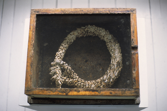
After Greg suggested I take a look at her paintings, I looked up the British native Cecily Brown online and was quite intrigued by her work. While her largely sexual related themes differ from the self-reflective themes I have in mind, her abstract style appeals to me. I plan to draw/paint particularly emotional or inspiring moments of studying abroad in England that I remember, either based on sketches of scenic views or from my memory. I want these to be personal, to kind of spill my guts out for all to see. I think taking a similar approach to Brown's abstract expressionism in my work could be one effective way to do this.

I decided to take the opportunity this weekend to see her exhibit, which opened recently at the Gagosian Gallery in NY, and it was pretty intense. Three rooms displayed large and smaller paintings, all abstract and ranging in color, and all without much hint of meaning or title.
Since I was familiar with her abstract expressionism, I expected to interpret each piece mostly on my own, but the lack of caption and title made it even more perplexing. I felt almost abandoned, left on my own to find an answer in each image. However, I also felt much freer to interpret Brown's paintings. While many of her works exhibit nothing recognizable, their colors and brushstrokes offer some kind of mood or trigger of emotion. Other works have subtle hints of familiar objects or figures or part of figures, which I liked. This leads the viewer to make his own connections between what he sees based on his own opinions, experiences and knowledge to find meaning. I think this a goal for many artists, like Slater and Sara's picks George Nick and Duane Michals; it is important to them, whether through photography or paint, to set a scene that the viewer can connect with and that evokes thought. In these ways the viewer connects more to the artist.

Still in other pieces, like her Skulldiver series, the subject of sex becomes abundantly clear in their subtleties. These made the trip with my dad a bit more awkward, but all the more interesting. They certainly sparked some great conversation and questions, wondering how Brown works, with preliminary sketches or is it spontaneous? You can see her knowledge of arthistory in her work, as it reflects styles of Willem de Kooning and Francis Bacon. I am most drawn to her use of color and brushstrokes and want to shadow those somehow in my project in order to emanate my own emotions and to spark similar reactions in the viewer. Since I plan to work with mixed media (pen, ink, pastels, etc.) and am still quite new in my painterly skills, I can't see myself producing work just like hers stylistically, but it is somewhere to start.

Here's a review of her exhibit

Julie Blackmon (Janna's Pick)


Julie Blackmon is a photographer who uses digital composites to create family scenes that are often chaotic or strange. She was the oldest of nine children and now she is the mother of three. These experiences led her to want to explore, as she says in her artist statement, "the need to simultaneously escape and connect." She is inspired by Jan Steen and other classic Dutch and Flemish painters. She says, "We live in a culture where we are both 'child centered' and 'self-obsessed.' The struggle between living in the moment versus escaping to another reality is intense since these two opposites strive to dominate."


Although I will be probably be using digital collage in a different way than she does, I am also interested in setting scenes and telling stories in my work. Her depiction of family life will be different than mine as an only child, but we are dealing with a similar issue in "the relationship between the domestic landscape of the past and present."


Blackmon also works in black and white photography. Her photos in this medium are about childhood. They remind me some of Duane Michals in that they have a similar dream-like quality, like in this photo titled "Trampoline." I really like the quieter, almost eerier quality of her black and white photos.

Julie Blackmon's official website
ArtInfo review
Boston University article

Diana Cherbuliez (Melissa'a Pick)

In art the choice of material is very important, some of the previous posts have shown this. Diana Cherbuliez is an artist who is fascinated with the choice of material and incorporates it into her work.


This piece is called "The End" and deals with infinity and death. It is made up of cigarette butts, glass and a beehive frame. Cherbuliez references her father(Who is a psychiatrist and a beekeeper) with the frame and her own bad habit of cigarettes and the cycle of bees, as well as the neverending cycle of death and labor in both. This interview talks more about this work and a few others.

What I like about Cherbuliez's work is the tediousness of her pieces and the intellect that fuels them. In this piece(above), titled "The Road to Good Intentions ", Cherbuliez uses matches and a mirror to complete a full image of a continuous bridge.

Cherbuliez has a number of works which uses mirrors. In "Not through" a young Alice is reflected infinitely with the use of a few mirrors, which reminds me of Josiah McElheny's Mirrored Glass Works. Diana also talks about this work in the interview, and says that "'Not Through' relates to my thinking about my lack of flexibility with imagination. I think that happened with puberty because with puberty I got a certain self-conciousness."

Diana Cherbuliez's website.

Enjoy.

Friday, September 26, 2008

Duane Michals (Sara's Pick)


Katharine Kuharic recommended Duane Michals to me after seeing my work in class on the 24th. He has strong beliefs about photography as a medium and its use to create true art which reminded me of Kuharic's own stance on morality and symbolism in art. Both artists take an active stance against passivity in art and its creation, and place huge emphasis on its use to incite thought, passion, and action. I admire them both for their drive and vision. The image is an extremely powerful means of communication and Kuharic and Michals use their art to to convey their strong philosophies and generate a specific message.

In one interview he's quoted,
"photography has to transcend description... it can never pretend to give you answers. That would be insulting." Michals attempts to recreate, simply by viewing a photograph, the depth of the mood and experience it depicts. "It's the difference between reading a hundred love stories and actually falling in love," he emphasizes. Duane Michal's photographs use a combination of image and hand written text to convey as realistically as possible, an actual mood and experience to the viewer. He uses collage, repetition, multiple exposure, and sequential frames to create visual narrative, the effect of which is enhanced by text, self written or taken from outside sources, to provide background and tone. I find his use of text intriguing and effective, but that is not something I wish to pursue in my own art. I like the idea of poetry inspiring photographs, but not the literal depiction of specific lines. I'm most drawn to his images that can convey mood and narrative on their own. The techniques used in these images to create the emotion and experience he refers to are elements I can incorporate into my own work.

Some examples of technique in my favourite images:
Balthus and Setsuko, 2000 - touching portrait focusing on the relationship of the two figures through pose, expression, etc
Joseph Cornell, 1972 (shown above) - use of long exposure to create a ghosting effect, hugely effective in creating a very eerie atmosphere
Rene & Georgette Magritte Holding Hands Behind a Tree, 1965 - juxtaposition of figure and landscape

http://www.faheykleingallery.com/featured_artists/michals_exhibition/michals_frames1.htm
http://www.photoinsider.com/pages/michals/michals.html

Tuesday, September 23, 2008

Jacob El Hanani (Greg's Pick)


Jacob El Hanani's work at the newly reopened Steve Zevitas gallery (Boston) is a gorgeous and subtle display of small marks that create intricate and yet simple geometric images. The drawings are done mostly in pencil or ink on paper- in modest sizes. I could not get over how quiet it felt inside the exhibit- largely because of how close you had to get to the drawings in order to appreciate them. Craft is a beautiful thing.

El Hanani's work relates to these issues of time and material- both of which are played out in delicate ways as we get absorbed into the drawings as viewers. He's also part of a drawing show 'Drawn to Detail' at the DeCordova Museum.

See the group show here.